top of page

Brand identity for product design duo; Tom and Maya . Creating a language that reflects their distinct styles and philosophies and would also be as dynamic and thoughtful as the objects they design.
TOMAYA
2023
BRAND INDENTITY
PROJECT SPEC
OSCO LONDON
Project Type
Rebrand
Services
Brand Design
Brand Architecture
Kinetic Motion Design
Website UI/UX
Industry
Product Design
Packaging Design
Design Services
Services
Brand Design
Kinetic Design
Print / Formatting
Website Build
Social Media Assets
Brand Story
We worked with Tomaya to develop a brand identity that captures the balance between their dual perspectives - technical and poetic, structured and intuitive. Our role was to create a language and visual presence that reflects their quiet design philosophy, while giving space for both personal objects and collaborative work to sit side by side. The result is a brand that feels as intentional and human as the objects they bring to life.


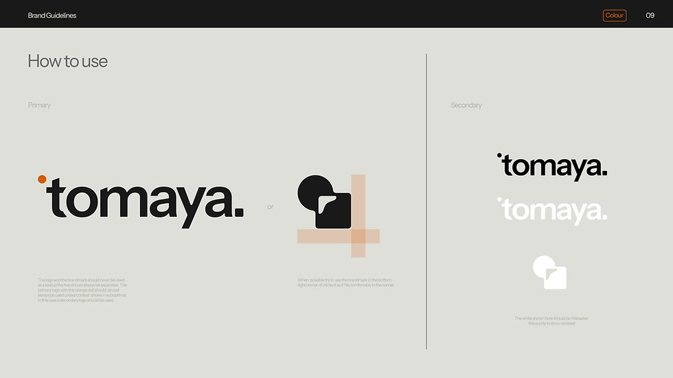
Logo/ brand mark
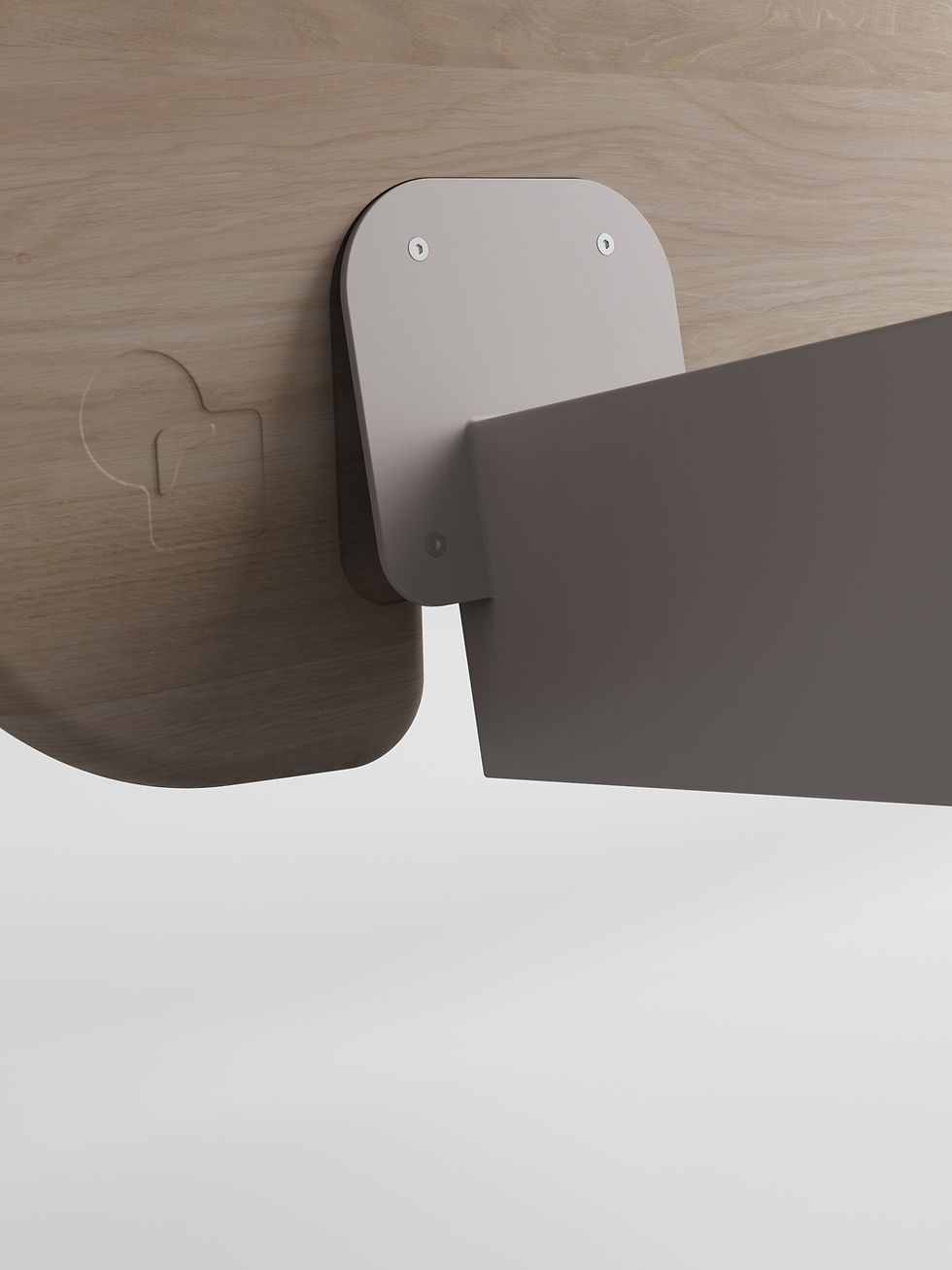
The Tomaya brandmark is a visual study in duality - a circle and square morphing into one, capturing the meeting point between contrast and cohesion. Inspired by the optical work of Kōkichi Sugihara, the mark plays with perception and balance, reflecting Tom and Maya’s unique partnership: technical and intuitive, precise and poetic. It’s a quiet illusion - a form that shifts depending on how you view it - much like the objects they design, which reveal their depth through use, interaction, and time.


Design language
Tomaya’s design language is calm, intentional, and quietly expressive. Instrument Sans brings a subtle geometry that reflects the studio’s thoughtful approach, while a minimal palette of black and soft grey provides a neutral foundation. An orange accent adds just the right amount of warmth - a quiet nod to intuition and unexpected detail.


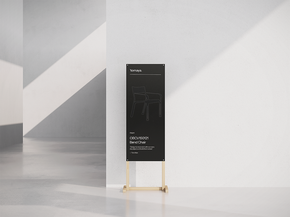
Item Code
We built a naming system that carries the clarity Tomaya needs without sounding lab‑coated. Each object gets tagged by form, finish, and moment in time, not as a cold division, but as markers of intention. The system becomes part of the story: something you sense in the silent precision behind every curve, the weight of material, the way light falls on joint and edge.


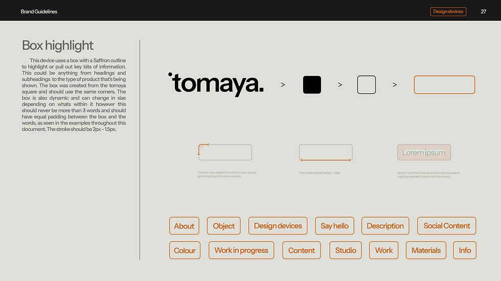
Design Device
We introduced the orange box motif as a graphic anchor, a simple shape, loud in contrast, soft in sentiment. It works like punctuation: sometimes framing an image, sometimes hovering over blank space, always pulling focus. It’s not decoration. It’s a marker of identity. A device that whispers, “This is Tomaya,” while holding the balance between studio work and crafted objects, part utility, part branding, all intention.


bottom of page