top of page

OSCO LONDON
2025
REBRAND
PROJECT SPEC
OSCO LONDON
Project Type
Rebrand
Services
Brand Design
Brand Architecture
Kinetic Motion Design
Website UI/UX
Industry
Tattoo
Piercing
Laser removal
Jewellery
Services
Brand design
Kinetic design
Print / Formatting
Website Build
Social Campaigns


Brand Story
We embarked on an ambitious project to redefine OSCO, a bold collective in the tattoo, piercing, and laser removal industry. The task was to craft a completely new brand identity that reflects OSCO’s evolution and resonates with a diverse, expressive audience. Our focus was on capturing the artistry, individuality, and commitment that OSCO brings to every story.


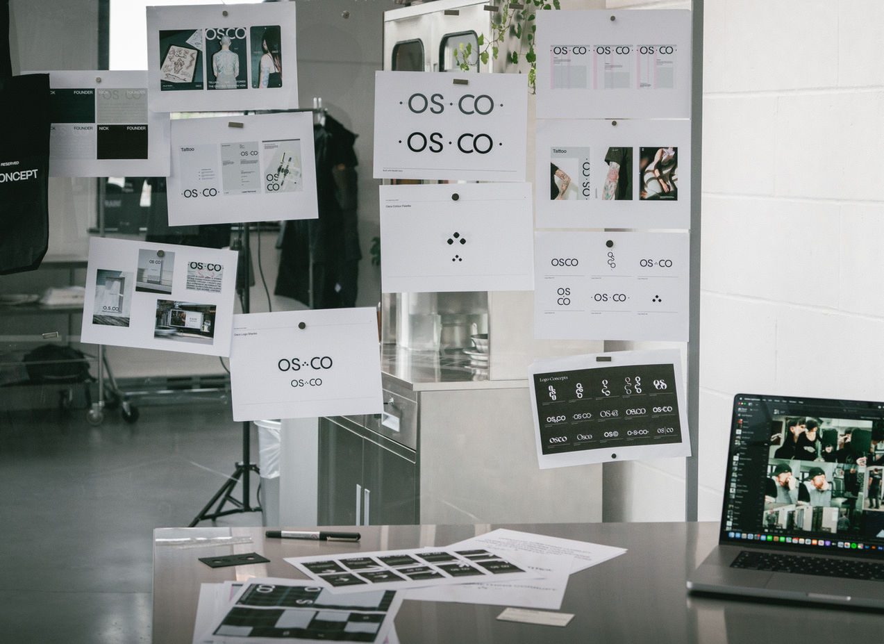
Logo system
At the core of the OSCO brand is a bold, modular logotype - confident, compact, and stripped of ornament. It adapts across formats without losing edge, balancing clarity with quiet attitude. It doesn’t follow tattoo clichés. It sets its own rules.


Design language
The visual system is brutal but clean - structured grids, sharp typography, and monochrome palettes softened by grain, gloss, and intimacy. It flexes from velvet signage to medical aftercare docs. And it always feels like OSCO: direct, expressive, and sharp-edged without being cold.


Tone of voice
The brand voice is built for transparency - direct, unfussy, and full of personality. From campaign headlines to client forms, we honed a tone that earns trust while keeping its charm. No fluff, no fakery, just straight talk (with a wink).


Beyond the rebrand
OSCO became more than a brand project - it became an ongoing creative partnership. We helped launch private experiences like OSCO EX, shaped internal ops systems, introduced new offerings like Tooth Gems & Grillz, and continue to produce campaigns, film, and content that grow with the brand.

bottom of page


