top of page

A refined identity and cohesive brand system for LAYN. A London based creative office made up of a network of designers, working with graphical, spatial and industrial clients.
LAYN CREATIVE
2024
BRAND IDENTITY
PROJECT SPEC
OSCO LONDON
Project Type
Rebrand
Services
Brand Design
Brand Architecture
Kinetic Motion Design
Website UI/UX

An all new brand for Spinlaunch's satcom division; Meridian Space, launching a new era of connectivity via fixed track orbit satellite constellations.
MERIDIAN SPACE
2024
BRAND EXTENTION
PROJECT SPEC
OSCO LONDON
Project Type
Rebrand
Services
Brand Design
Brand Architecture
Kinetic Motion Design
Website UI/UX
A refined identity and cohesive brand system for LAYN. A London based creative office made up of a network of designers, working with graphical, spatial and industrial clients.
LAYN CREATIVE
2024
BRAND IDENTITY
PROJECT SPEC
OSCO LONDON
Project Type
Rebrand
Services
Brand Design
Brand Architecture
Kinetic Motion Design
Website UI/UX
Industry
Creative
Design Services
Interior Spaces
Community
Services
Brand Design
Brand Architecture
Kinetic Motion Design
Film Production
Brand Story
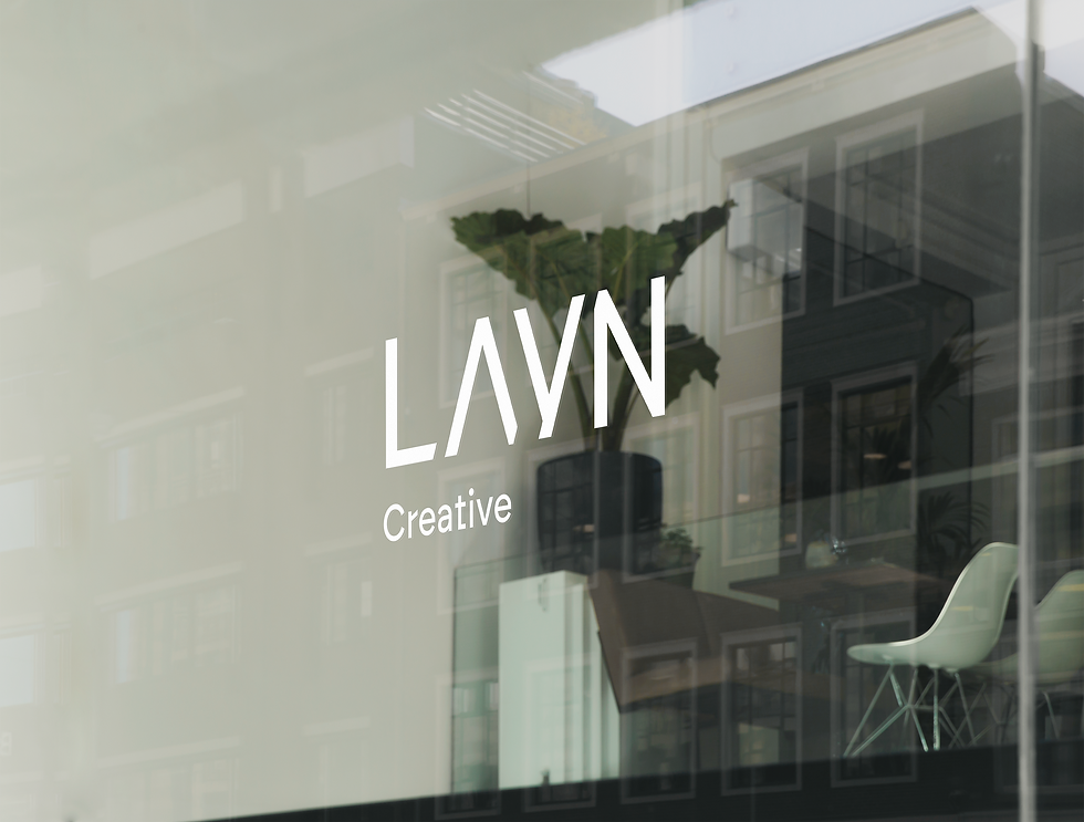
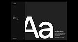
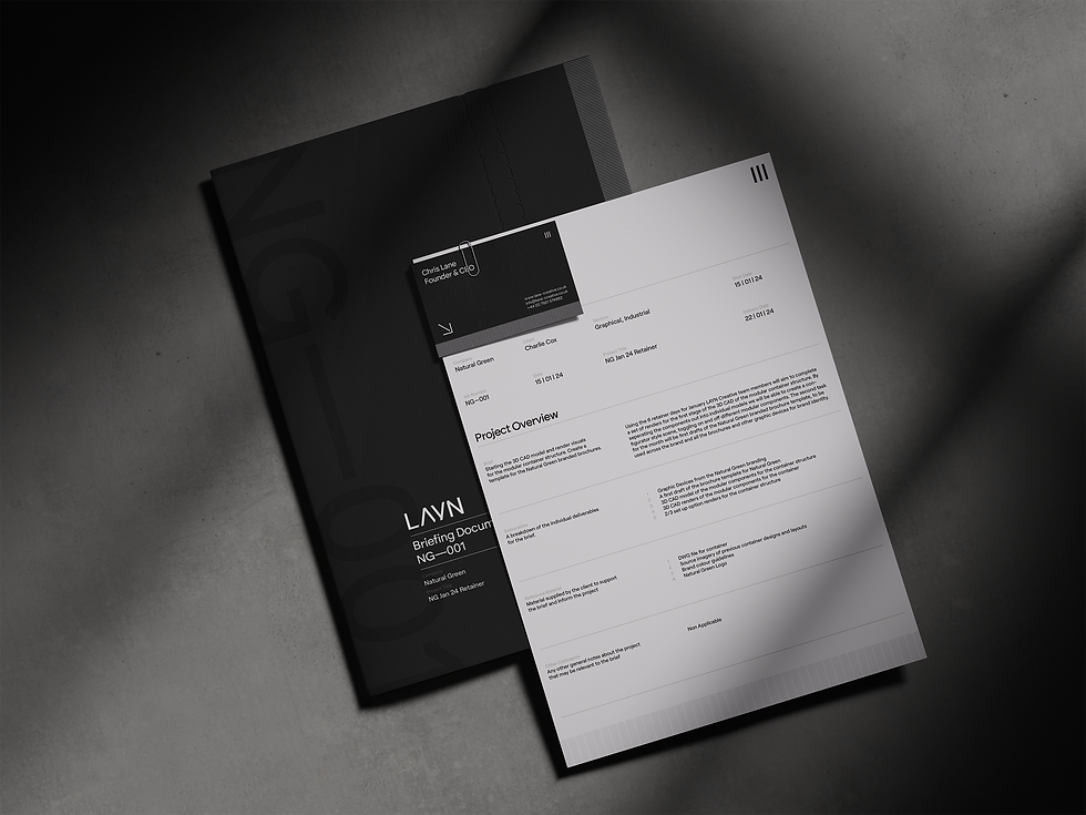
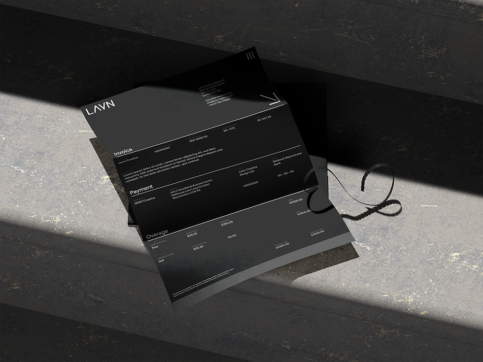
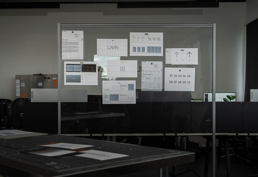
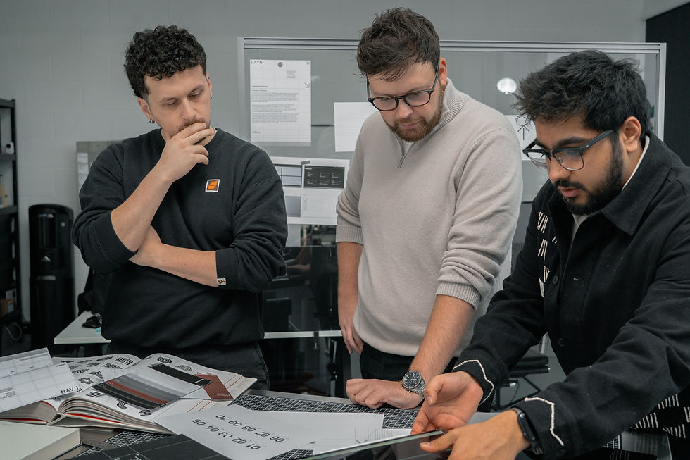
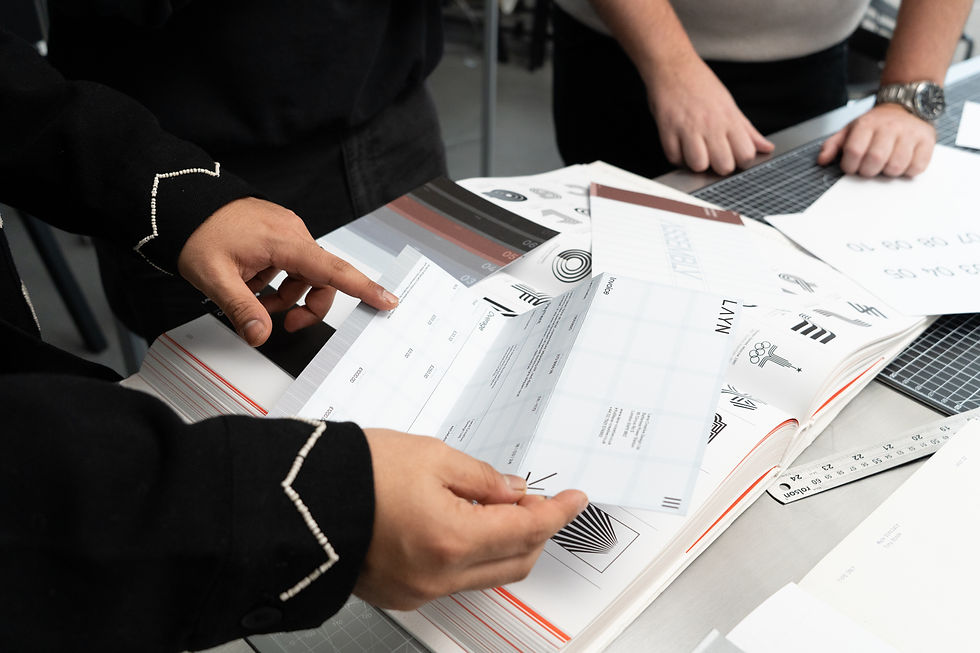
We worked with LAYN Creative, a London-based design studio specialising in spatial, industrial, and graphical design, to build a flexible brand identity that could move across disciplines. Through a combination of strategic workshops and creative exploration, we developed a complete visual system, including design language, micro-identities, motion, templates, and toolkits, giving LAYN the clarity and tools to grow with confidence.


Logo build
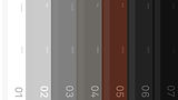
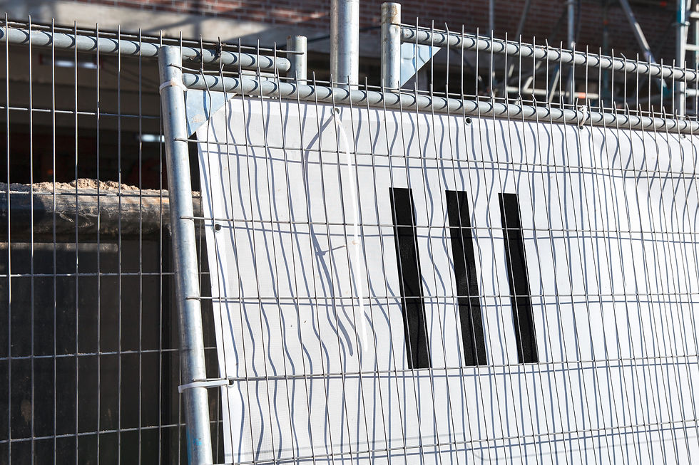
The LAYN brand mark is built from three vertical lines, a graphic abstraction drawn directly from the wordmark itself. Found in the stems of the “L” and “N,” these lines subtly reflect the studio’s name while also representing its three core disciplines: spatial, graphical, and industrial design. The negative space between them creates a sense of motion and structure, echoing “lanes” in both form and function, and reinforcing the studio’s modular, multi-directional approach.


Architecture
As an extension of the core brand, LAYN Assembly serves as the studio’s creative network, a space for collaborators, partners, and the broader design community. Its identity is closely linked to the parent system but distinguished through its use of “Brick” maroon, a warm, grounded tone inspired by the terracotta brick of Battersea Power Station, where LAYN is based. This colour cue, along with a tailored visual treatment, gives Assembly its own presence while staying connected to the overall brand architecture.


bottom of page